 01
01
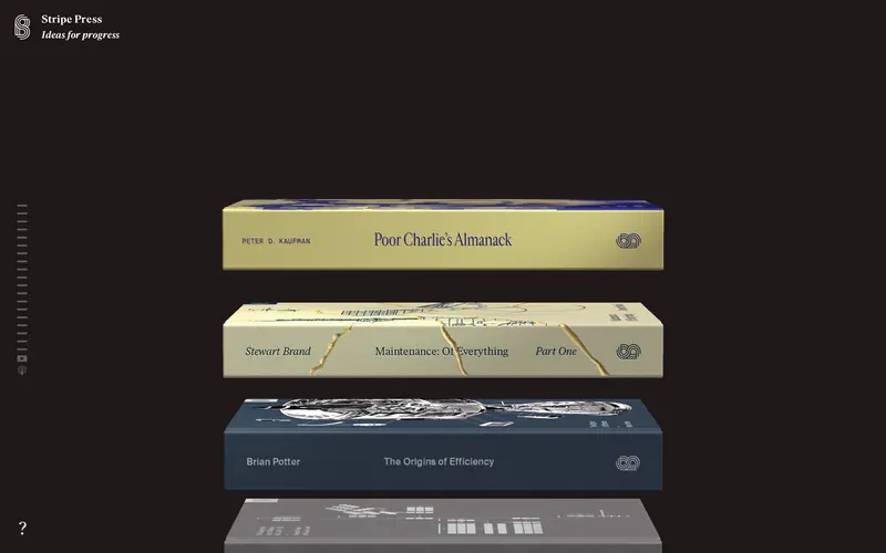
Stripe Press press.stripe.com
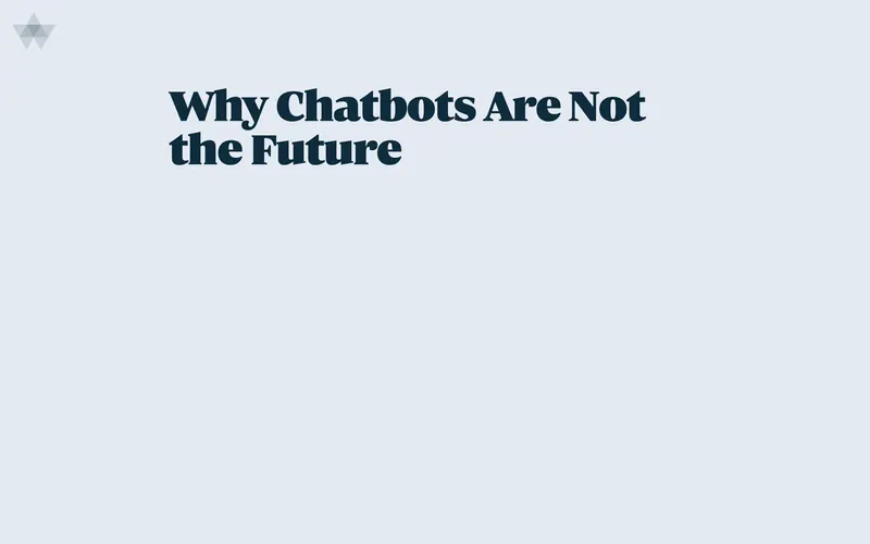
A bookshelf rendered in WebGL as physical objects with real depth and light, proving a catalogue page does not have to be a grid of flat rectangles.
A map of visually impressive UI — judged on craft and technique
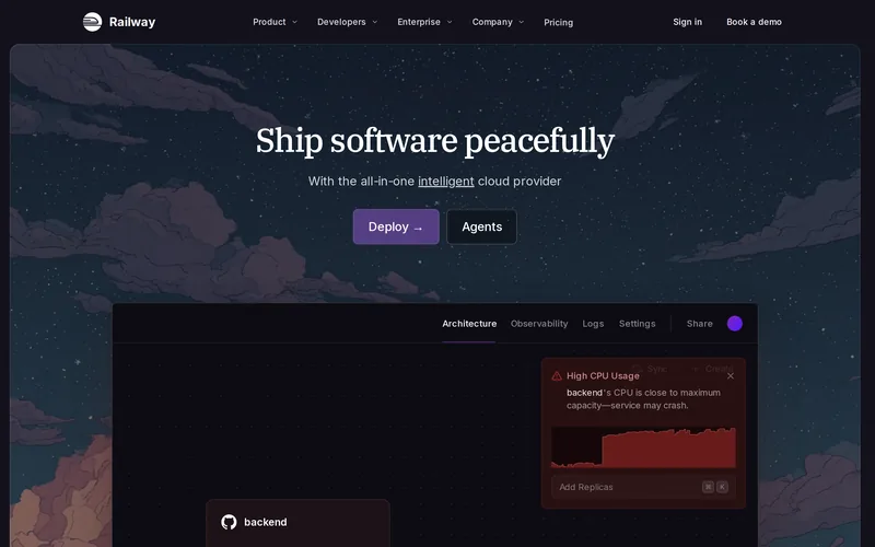
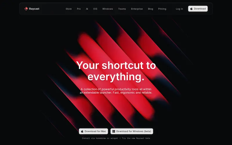
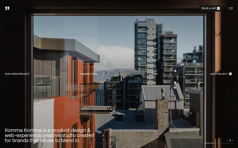
74 sites · 8 archetypes · screenshots taken liveA map of visually impressive UI — judged on craft, art direction and technique, not on speed scores. These 12 clear the bar hardest across every archetype. Paste any URL above and it jumps you to the best of its kind. Screenshots taken live on 2026-09-23.
The long column — Scroll-heavy. Article layouts, long vertical flows.
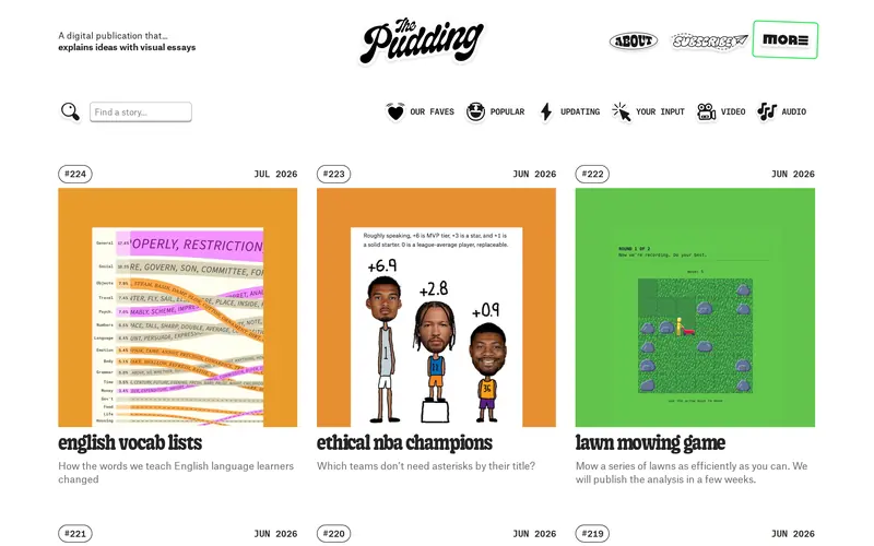
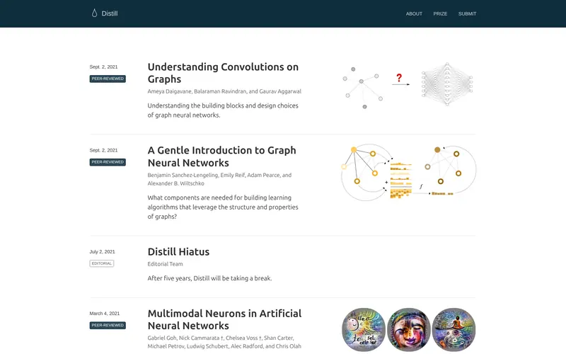
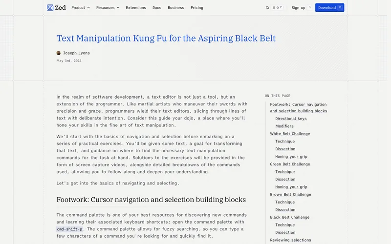
The whole build serves one axis: down. Layout is a single measured column with full-bleed interruptions, so the hard problems are typographic — measure, rhythm, widow control, where a figure is allowed to break the column. The ones worth studying go further and make the scroll itself the mechanism: a diagram that assembles as you read past it, a figure you can drag. That costs a bespoke build per article, which is exactly why almost nobody does it and why the handful who do are the reference.
Interactive explainers · Long-form & editorial · Reference & research
The panel and the canvas — Task-oriented. Form and panel-driven flows, component-based code.
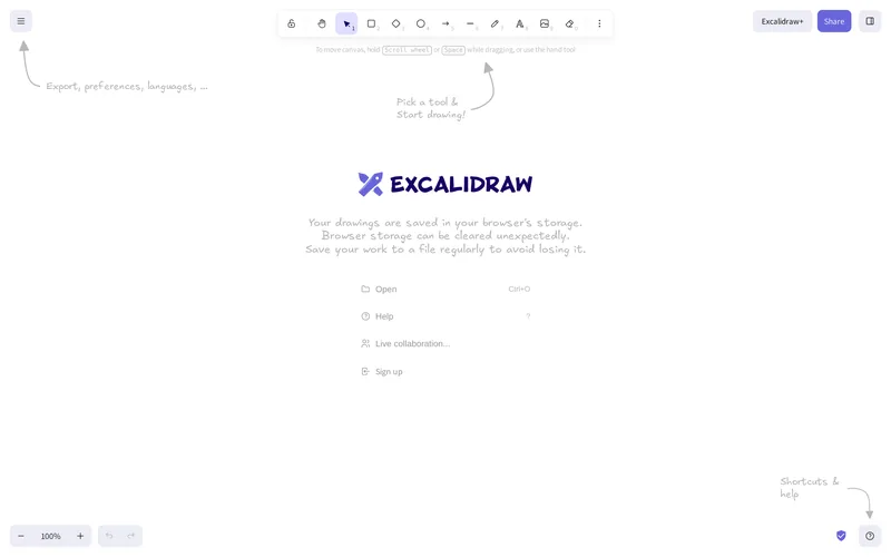
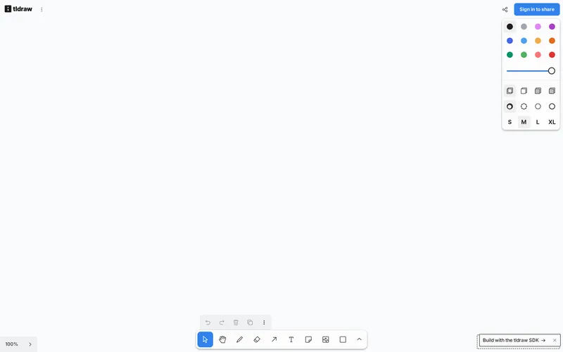
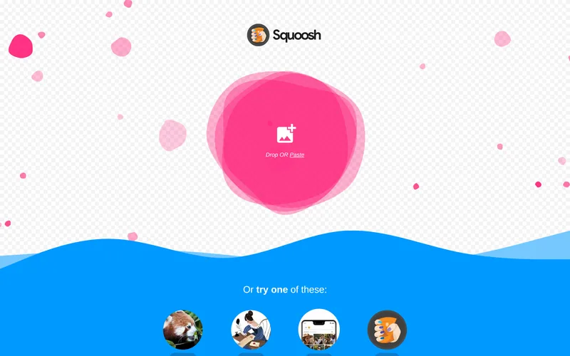
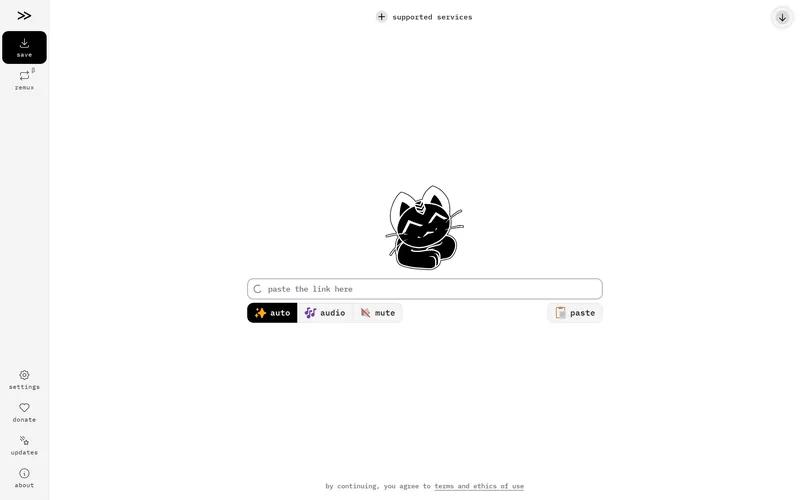
There is no page here, only state. The user arrives with a job, and everything is judged by how few steps stand between arrival and output. Layout is a fixed shell — toolbars, panels, a working surface — that does not scroll as a document; the scrolling happens inside regions. Code is component-based and client-heavy by necessity: undo stacks, dirty state, optimistic updates, keyboard maps, focus management. The ones that feel expensive spend their craft on latency and on the physics of dragging something, not on decoration.
Creative & canvas · Product surfaces · Single-purpose utilities
The endless stack — Scroll-and-refresh heavy. Infinite lists, real-time updates.
The list has no bottom, so the list is the architecture. Cursor pagination instead of pages, virtualised rendering so the DOM does not grow without limit, scroll-position restoration when you come back, and a strategy for content that arrives while you are reading. Almost every feed on the internet is visually identical; the few that are not got there by treating the card itself as a designed object rather than a container, and by being willing to show fewer things at once.
Visual feeds · Timelines
The grid and the funnel — Product and checkout flows. Cart state, grid-based code.
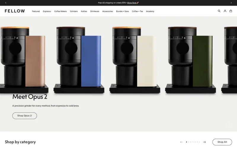
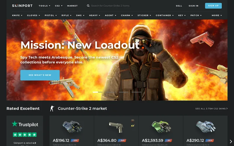
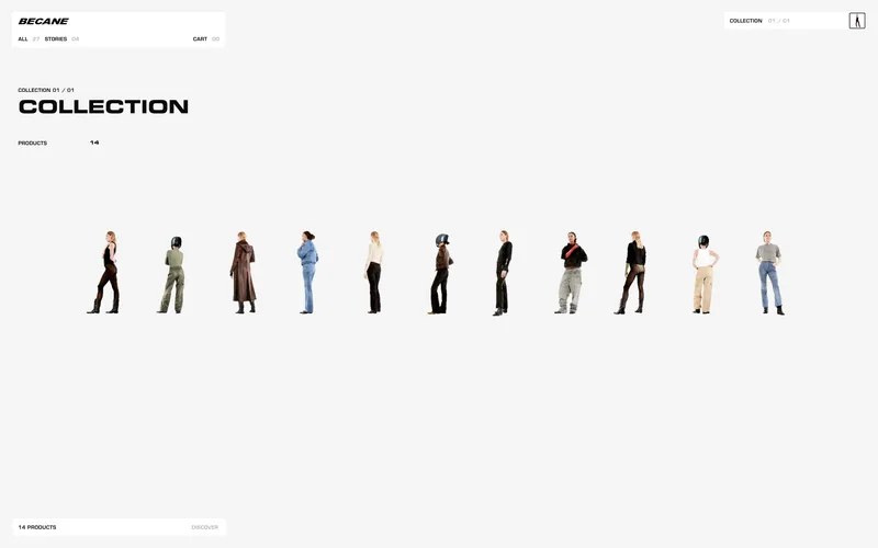
Two different machines share one site. The browse half is a filterable grid where image discipline decides whether it looks expensive — one locked aspect ratio, cropped to fill, loading fast enough that the grid never reflows. The buy half is a linear funnel where every extra field costs real money. The brands worth studying spend the entire budget on photography and type, then have the nerve to leave the rest of the page empty — and, crucially, carry that restraint all the way through checkout instead of abandoning it at the cart.
Brand-led · Product storytelling · Marketplaces
The tile field — Data-heavy. Grids, cards and charts over state-managed layouts.
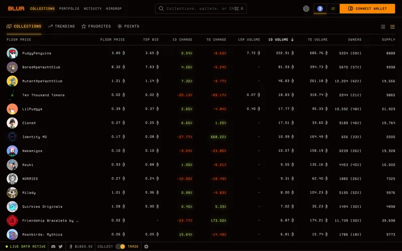
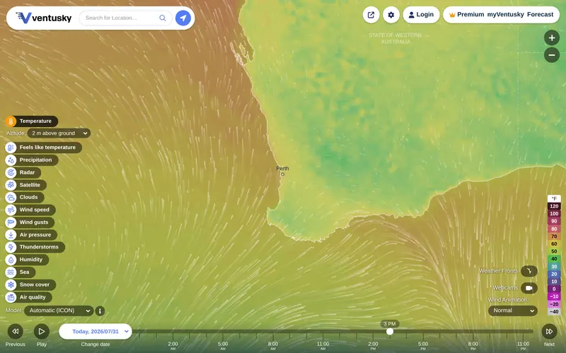
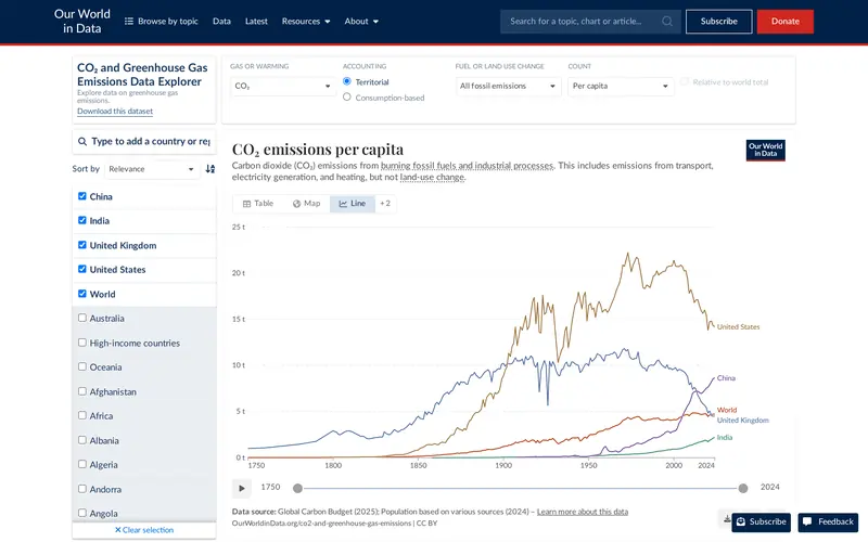
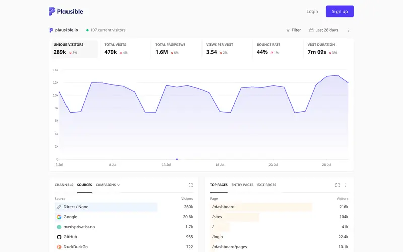
The job is to answer what is happening right now in one glance, which makes hierarchy the entire design problem: one number has to be obviously more important than the forty around it. The business dashboards people actually admire sit behind logins, so the public examples worth studying are the live-data explorers — planetary-scale datasets rendered continuously, where the map IS the interface and the controls have to stay out of the way of it. Excellence here is density handled gracefully, and a colour ramp that survives being wrapped around a globe.
Product analytics · Live data explorers
The stage — Persuasion-led. Real-time 3D, scroll choreography, one memorable moment.
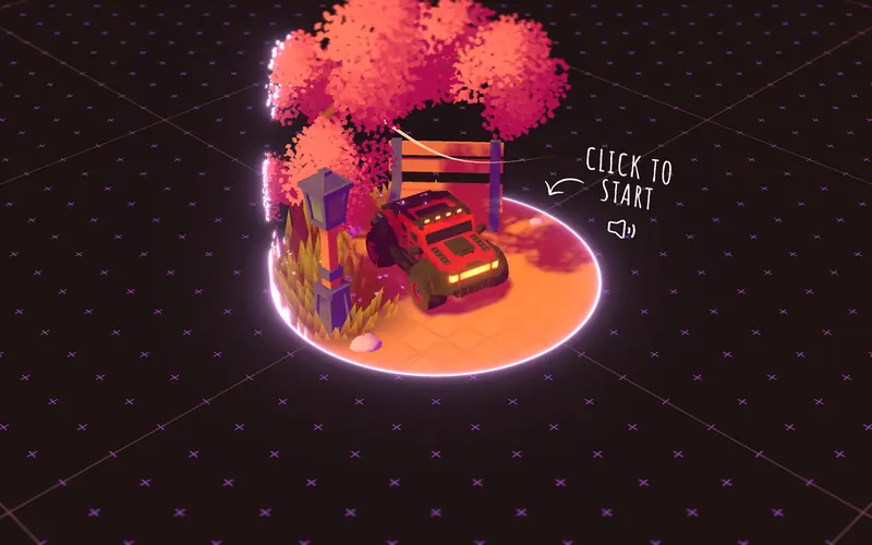
This is where the visually extraordinary work actually lives, and it is a different discipline from the other five. There is no dataset and no task — the whole page is one directed experience, so the budget goes into a real-time renderer, a physics simulation or a scroll score, and the engineering problem becomes holding sixty frames per second while doing it. The trade is brutal and worth seeing plainly: these are the heaviest pages in this directory, they routinely fail the performance tests the other categories pass, and they need a static fallback for anyone who cannot run them.
Real-time 3D · Art-directed launches
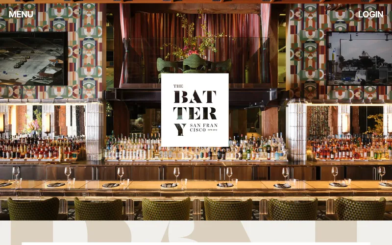
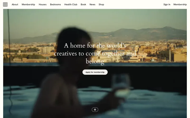
The room — You are inside something, or you are applying to be.
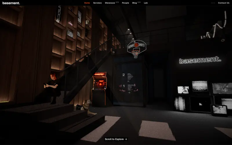
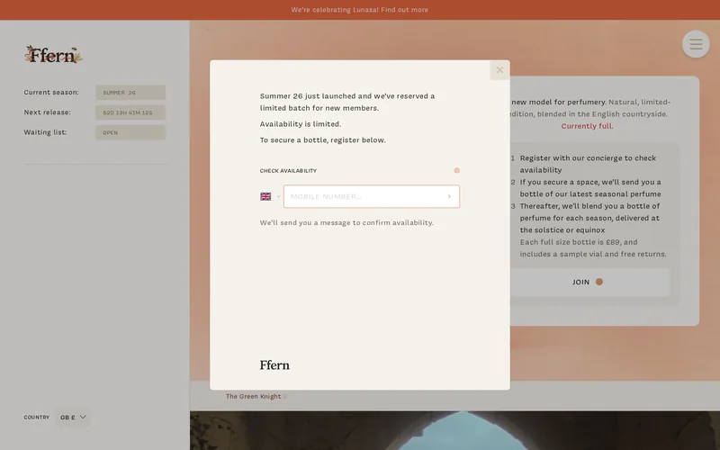
Every other archetype is built to serve a stranger on their first visit. This one is built to make a stranger feel the door. The interface withholds: it shows you the room and puts a login, a waiting list or an application between you and it, and that withholding IS the product. Structurally that means an auth boundary drawn in public — a members shell behind the marketing shell — so the code carries two states of the same page and the logged-out one has to sell rather than serve. Expect full-bleed atmosphere over dense navigation, ambient video, real photography of a real place, and scarcity rendered as live state (a season, a counter, a list that says FULL) rather than as a banner. The failure mode is the opposite of a dashboard's: it is not confusion, it is a room that reads as empty.
IRL clubs · Digital clubs
The index — Useful for the hunt. Not held up as examples themselves.
Everything in categories 01 to 06 is here because of how it is built. This one is the exception and it is worth saying so plainly: these are listed because they are USEFUL to anyone doing this work, not because we are holding their interfaces up as the standard. Several are galleries we check ourselves — including the one whose jury awards we cite on the cards. Where a resource does also clear the craft bar it is cross-listed into the category it earns, rather than being quietly promoted here.
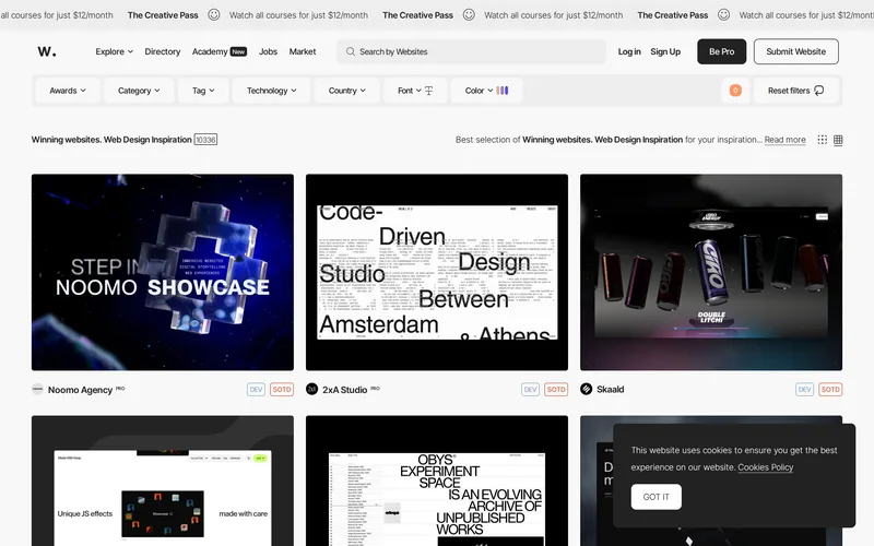
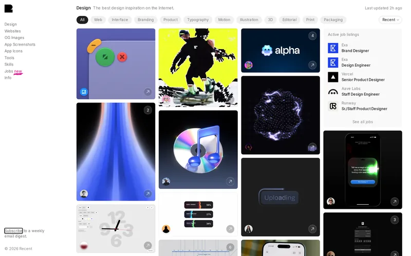
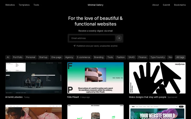
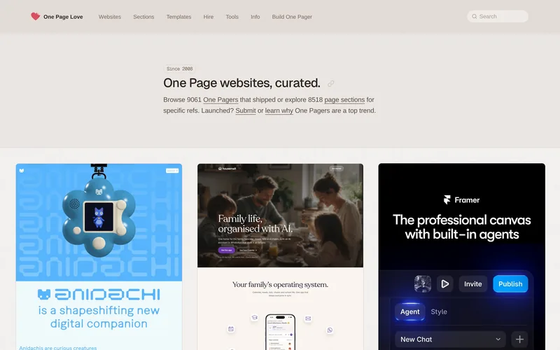
Galleries · Studies & references
A site is admitted only if a working designer would screenshot it and send it to someone. Calibration point: press.stripe.com.
Being a good example of its archetype is not enough. The first version of this bar admitted documentation, plain aggregators and unstyled essay pages — correct about architecture, useless as inspiration. Every entry now clears at least one of:
Three axes, never averaged. They disagree on purpose: the real-time 3D work in 06 routinely fails the performance tests a plain documentation site passes, and that tension is the useful part. A single blended “design score” would hide exactly the trade-off you came here to see, so there isn’t one.
Real Hacker News threads about these sites, pulled 2026-08-01. Attention, not a verdict — it favours sites that are old, open source or free.
| 4,338 | Apple AirPods Pro | Steve Jobs has passed away. | 2011-10-05 |
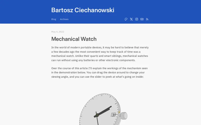
| 3,128 | Bartosz Ciechanowski | Moon | 2024-12-17 |
| 3,053 | Bartosz Ciechanowski | Sound | 2022-10-18 |
| 3,014 | Bartosz Ciechanowski | Bicycle | 2023-03-28 |
| 1,216 | Apple AirPods Pro | The Swift Programming Language | 2014-06-02 |
| 1,170 | Apple AirPods Pro | Apple Faceshield | 2020-04-07 |
| 1,056 | Glass | Physical assault by McDonald's for wearing Digital Eye Glass | 2012-07-16 |
| 930 | Distill | Distill: a modern machine learning journal | 2017-03-20 |
| 849 | Ventusky | Ventusky – Weather data visualization | 2017-02-03 |
| 843 | Glass | Looking Glass: Run a Windows VM on Linux in a window with native performance | 2021-07-18 |
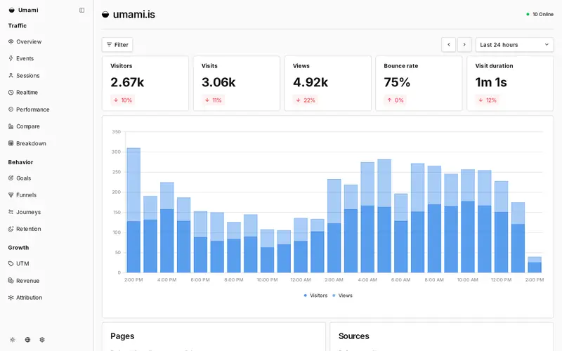
| 820 | Umami | Umami: Self-hosted open-source alternative to Google Analytics | 2020-08-18 |
| 803 | Glass | What are those grids of glass in the sidewalk and why are they purple? | 2020-01-03 |
Each archetype has its own spray can and its own diagram of the skeleton — the structure the code has to have before anything else is decided. The same marks run through the whole directory. The coloured mark shows the part that moves: the scrolling column, the dragged shape, the arriving post, the item entering the funnel, the number that just changed.
Partly implemented Two axes ship on the cards — craft and technique. The rest of this table is the honest argument against measuring what we have not measured. Published so the case against each metric is on the record before any number is.
| Metric | How it would be measured | What it tells you | The argument against it |
|---|---|---|---|
| Performance | Lighthouse performance, mobile emulation, median of 3 runs | Comparable across sites and re-runnable by anyone. | Penalises heavy-by-design work. The real-time 3D in 06 fails this by construction. |
| Accessibility | Lighthouse / axe automated pass, plus a keyboard walk of the primary flow | Catches mechanical failures cheaply. | The best automated tools catch roughly 40% of barrier types — a green score is a floor, not a verdict. |
| Code cleanliness | DOM node count, stylesheet weight, unused-CSS ratio, third-party script count | Approximates whether the front end is built or assembled. | Every one of these is gameable, and none of them read the source. |
| Community signal | Hacker News points and comments; GitHub stars where the site is open source | Already collected here, and independently verifiable. | Measures attention and age, not quality. A 2013 thread outscores a better 2025 site. |
| Retention | Return-visit rate, session depth | The only metric that measures whether the UI actually worked. | We have no honest way to obtain this for sites we do not run, and will not buy panel data. |
An index for finding an interface to learn from, grouped by construction — a crypto tool and a photo editor share far more code than a crypto tool and a crypto news site.
Chosen by hand against the bar above. Not voted on, not ranked, and not scored. Anything that was merely a good example of its archetype was cut.
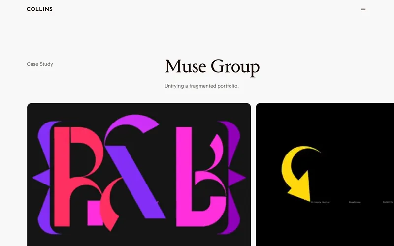
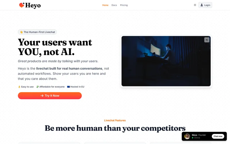
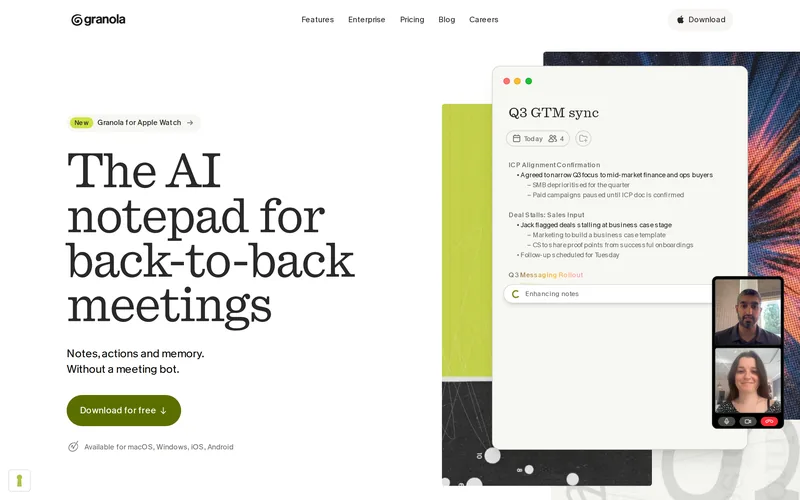
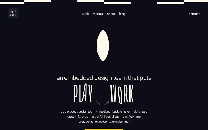
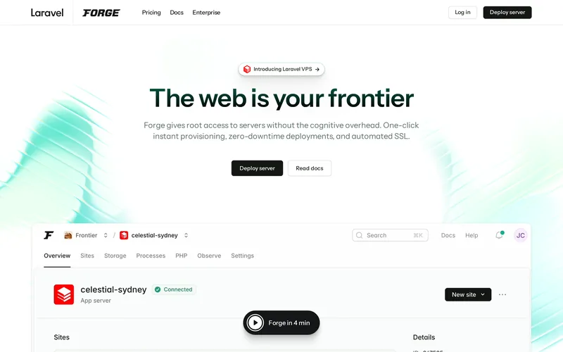
Captured from each public page on 2026-09-23 at 1440×900 and shown for editorial identification, each linking to its source. Consent dialogs were dismissed where they appeared; nothing else was altered.
Runs server-side on a free model. It reads only a page’s title and description, can answer with nothing but one of these archetypes, and never chooses the examples — those come from this catalogue.